Here is a filmed evaluation on how previous filming tasks have helped produce our final media product.
Showing posts with label Emily Bland Evaluation. Show all posts
Showing posts with label Emily Bland Evaluation. Show all posts
Monday, 23 April 2012
Saturday, 21 April 2012
Evaluation Q6: Emily Bland
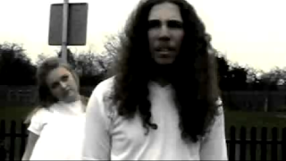
Here is a prezi that I created explaining the different technologies that we used in order to complete our film: The Lullaby.
Evaluation Q5: Emily Bland
I have done various types of research such as looking at IMDB ratings for 5 chosen films and the certificates of films, to know what content will be appropriate for our own film.
BBFC Research

Drugs- the misuse of drugs must be minimal and infrequent
Horror- Disturbing physical or psychological sequences must not be frequent or sustained.
Dangerous behaviour- Behaviour such as hanging etc. should not be in detail or appear to be pain or harm free.
Language- use of strong language such as 'Fuck'should not be frequent
Nudity- it is allowed, however be brief and discreet
Sexual activity- Must be brief and discreet.
Violence- Moderate violence is allowed but should not be dwelled on.

Drugs- Drug taking can be shown but cannot be encouraged.
Horror- Strong threats can be shown
Violence- Easily accessible weapons are not to be glorified/glamourised
Language- Strong language can be used frequently
Nudity- Strong nudity content is allowed but should not dwell on sexually.
Sexual activity- sexual activity may be portrayed in strong detail
Violence- May be strong but should not dwell on infliction of pain or injury.

Sexual activity- can contain explicit images of real sex and sexually explicit animation.
IMDB User Ratings
What lies Beneath

You are able to see from the user ratings that it appealed more to a male audience of the late teens to mid 40's. This may be because the lead character is a woman and so males are more tempted to watch it.
The Grudge

For The Grudge it is clear that it is mostly males between the ages of 18-29 make up the majority of it's audience. Yet again the protagonist is a young female.
White Noise

White Noise is a fairly fast pace film and so it appeals more towards males and from reading the user ratings the majority of them are aged between 18-29.
The Woman In Black

From the user ratings we can see that the film was more popular for a male audience ageing between 18-29.
Ghost Ship

The main audience for Ghost Ship is Males as it has elements of action involved and gore.
It is clear from looking at all 5 of the user ratings for these ghost films that our target audience must be males between the ages of 18-29 as they seem to find the ghost element of a horror film interesting.

We chose to go against the common representation of the lead victim being female as we wanted our male audience to be able to relate to the feelings of the protagonist more. We also chose to include ghosts that are children as this is what is commonly used in many ghost films such as Ghost Ship.
Our feedback for our film from the class was mostly positive with them liking the music that went over the footage as it helped create a scary, creepy atmosphere.
Friday, 2 March 2012
Evaluation Q3: Emily Bland
Distribution of films is when film companies promote their films by using posters or trailers to advertise it to an audience. For our own film we will create a poster that will help promote it using all the relevant information e.g. Title, actors names etc. Major distributers have a much higher budget therefore they are able to widely advertise the trailers on T.V, use posters and create merchandise that relates to the film. However, independent film companies have a lower budget and generally only stick to trailers and posters.
You could upload your film to Youtube or enter them in film festivals such as the Bang! Short film festival
You could upload your film to Youtube or enter them in film festivals such as the Bang! Short film festival
Here are two local short film makers from Nottingham that entered their film in the festival, we could also do this to distribute our own film.
LIONSGATE
 Lionsgate have used this poster to portray 'Saw II' as a gruesome film. The title of the film suggests that it is about extreme torture because of the way 'Saw' looks like it has been with fingernails. Due to the presence of the mask, on what would seem to be the threat, it gives the audience the idea that these torturings will be seen as a game to the villain.
In the trailer for 'Saw II' Lionsgate have use fast editing with occasional lengthier shots to give an intense atmosphere, enticing the audience with the deep voices of the villain and making them become intrigued and eager to see more. They use lots of different images close together that are associated with the genre of the film to let the audience know that this is a gruesome, torturous film.

HAMMER
Hammer have used very dark grey/blue tones for the poster to create a dark and dreary atmosphere, as if all the happiness had been removed from the place in which it is set. This attracts an audience as they begin to wonder why and how this has happened. It is clear that the cloaked figure at the back of the poster is the threat as it is looking towards the main character from behind.
By using more familiar things such as music from childrens toys and little country villages, this trailer helps people relate to old time english countryside making what is happening seem like it could have been true which makes it scarier for an audience.
FANTASTIC FILMS
 The poster for The Wake Wood suggests that this film is about trying to break free and escape Wake Wood as the hand is reaching out of the ground. The blood running down the arm tells us that there will be gore and that some characters will be fighting for their lives. I believe that this is a very effective poster as it creates an air of mystery as to what is going to happen. This would be the sort of poster which would be put up on poster boards, at bus stops etc.
This trailer is fairly fast and jumps very quickly from one thing to another to mirror the way that the characters have a time limit in which they have to sort out their situation with their daughter that they brought back from the dead. This differs from the slow calm pace of the trailer for 'The Woman In Black'.

We based our poster around the Paranormal activity posters as we liked the idea of using a still from our film.

Here is our poster for our film, we took a still from our title sequence and created a tag line to make the poster seem more chilling.

We created our Red Balloon Productions logo by focusing on the layout of the Dreamworks logo, especially focusing on the clouded background. We chose to make the clouds dark and gloomy as it is for a horror film so we wanted to mirror the atmosphere of the film. We also used bold, clear font so it is easy to read and stands out.

Thursday, 23 February 2012
Evaluation Q4: Emily Bland
From the IMDB research I did for the film 'The Ring' and 5 other films including 'Ghost Ship', we are aiming our horror film at a male audience between the ages of 18 and 29. From the research of the other horror films watched, the ages of the audience were either the same or very similar.
We plan to challenge the common representation of the lead victim as we are going to use a male actor instead of female so the male audience are able to relate much more easily to how the character reacts and how he might be feeling.
 The film Ghost Ship portrays the male characters as fairly week people as they are soon killed or injured as they often put actions into motion without thinking about the consequences and this is what happened to some of the men in ghost ship. So our male character will be a very vulnerable character to reinforce the idea that men are weak in ghost films.
We plan to challenge the common representation of the lead victim as we are going to use a male actor instead of female so the male audience are able to relate much more easily to how the character reacts and how he might be feeling.
Monday, 6 February 2012
Evaluation Q2: Emily Bland
It is important to look at representation to understand how certain characters should be portrayed to the audience of your horror film. For our film we have looked at different extracts of films and have seen that the majority of victims have been represented by young females to appeal to a male audience.
From this clip of the ring you can see that the female, Rachael, is the victim. this is evident through her posture and clothing. She is a single mum and has been portrayed as a weak woman in this scene as she is wearing casual baggy clothing and isn't bothered about her presentation. This is the typical stereotype for a single parent, they are made to seem as though they cannot cope on their own and so seem in need of help. mostly close-ups and midshots have been used when focusing on Rachael in order to see the pain and worry that she is feeling making her seem much more vulnerable.
(4.47-8.10mins)
In this clip from The Messengers the main victim is a female, some high angle shots have been used to portray her as a weak and vulnerable character which is how females are normally portrayed. The tight fitting clothes show that she is quite feminine and gives the impression that she may not be able to handle herself in the situation that she is in. The fact that the victims family does not believe that strange things keep happening to her make her even more of a vulnerable character as she is purely alone with what is happening.
.jpg)
We used a fairly small female to play our ghost as through research we have found that the majority of ghosts have been young small girls. This can be seen in films such as 'The Ring' and 'The Grudge'.
We have chosen to use a childrens environment to film our horror film as the creepiest locations in films tend to be them associated with children. The reason for this is that children are not supposed to die therefore those places are normally fairly eerie.
 From looking at the audience research sheets we have used characters between the ages of 16-17 as these were the ages of the majority of the characters in the ghost films we had watched. We also have a white cast as the most of the films had predominately white casts.

(5.10-5.27mins)
In this clip from the grudge they have used a young female as the victim as younger people tend to believe more in supernatural things. We didn't use a young female, however at young male still has a similar effect as a young life is being taken away by a ghost. We chose to challenge the stereotypical 'damsel in distress' character by using a male actor so the the target audience (mainly males) would be able to relate more to the character and his feelings.

I produced a Wordle to display the feedback we got for how successful our content was for our target audience. You can see that we had positive feedback therefore we have been successful in achieving the appropriate content.
Sunday, 5 February 2012
Evaluation Q1: Emily Bland
Here are some images that have inspired our film and helped us understand some of the generic conventions of a ghost horror film.
Film Logo
I like the Dream Works logo as it opens up many opportunities for it to be adapted to a specific genre. To make the logo relate to a ghost film the blue night sky could be turned black to represent the blackness, the unknown of life after death. I think the fact that the font is very simple works well as there is a fair bit going on in the background and so we are able to focus clearly on the logo.
Our Film Logo
Titles

The titles from The ring are very simplistic yet effective. The use of bright white/grey writing, which is associated with the colour of ghosts, gives a bleak and empty atmosphere, especially when the main title is shown due to the circle of light creating a hallow space. The minimalistic titles prepare you for the film as the writing is fairly child-like, suggesting that the story is based around a child. By not using capitals for the names and by spacing the letters out it again gives the impression that small children are the centre of the film.
Our Titles
 We decided to use a simple and clear font instead of a child-like font for our titles as we thought this had a much better effect. The use of red gives connotations of danger and death which is what we want our audience to see from our titles.
 By creating an old time look to our titles sequence it has transformed a normal home video to creepy footage. This sort of footage is common in horror films.
establishes Sub-genre
.jpg) By using a bleak and desolate looking setting to place the well, it gives the impression that this has been deserted for quite a long period of time. This is common in ghost films as the ghosts generally have died many years ago. By using blue tones this creates a cold and lifeless feel, which mirrors that of what our standard perception of a ghost is.
By using a bleak and desolate looking setting to place the well, it gives the impression that this has been deserted for quite a long period of time. This is common in ghost films as the ghosts generally have died many years ago. By using blue tones this creates a cold and lifeless feel, which mirrors that of what our standard perception of a ghost is.
 From this clip from our film you are able to see that it is a ghost horror film due to the boy in the foreground being unaware of the person standing behind him and because of the creepy lifeless way the girl is looking at him.
Establishes character
 From this clip from The Grudge you can see that they have used the generic black haired, white clothed deceased girl as the threat. By doing so it creates a mystery as to who she is. Because the deceased girl is behind the victim this instantly makes the victim seem more vulnerable as they cannot see the threat.
 From this shot we are able to see that the victim looks like an average teenage boy through the basic clothing he is wearing. We are also able to see that he is very confused about why and where he is due to puzzled facial expressions.
Mise-en-scene
 This is a scene from the grudge, they have created an ordinary realistic bedroom which an audience would be able to relate to. The fact that people would be able to relate to it makes it even scarier as it is happening in a normal environment.
 The use of a play park in our film gave it a creepy atmosphere as it is supposed to be full of happy children whereas here it is empty and eerie. Using locations that are supposed to be full of people is very common in horror films.
Key Images
 The still from The Sixth Sense suggests that the boy in the foreground is the victim as he is lower down in the shot.

We also used high angle shots in order to portray the lead character as the victim, making him appear weak and vulnerable against the girl ghost.
 The dim lighting creates a creepy atmosphere, the old books and extra lighting that is needed from the character suggests that this is a fairly old place she is in which is normally the centre of a horror film.
 We used fog to create a spooky, eerie atmosphere. This lets the audience know that the threat is about to appear in some way or another. the use of fog is a typical convention on horror films.
 The little girl from Silent Hill has been transformed to look as though she has been brought back from the dead. This is done by making her seem very pale and using spats of blood on her face. This is very typical 'dead' make up.
 We made the ghost's eyes look slightly darker to give a drained lifeless look to her and dressed her in a dress that looks like a hospital gown to make her seem even more out of place in the park. Giving ghosts costumes like this is very common as they always seemed to be portrayed as slightly insane characters.

By putting the victim in white clothing it makes her seem innocent and vulnerable. The dim lighting is in contrast with the character making her stand out and focus on her stance and facial expressions.
Film Logo
Our Film Logo

For our logo we took the idea of a cloud background from the Dreamworks logo. However, we changed it to be dark and gloomy to suit the genre of horror. We used a brightly coloured balloon to make it stand out and make it seem like it is in a dangerous place as it is much more vibrant then the background. Again like Dreamworks, we used a clear and simple font so the film company's name can be seen easily.
The titles from The ring are very simplistic yet effective. The use of bright white/grey writing, which is associated with the colour of ghosts, gives a bleak and empty atmosphere, especially when the main title is shown due to the circle of light creating a hallow space. The minimalistic titles prepare you for the film as the writing is fairly child-like, suggesting that the story is based around a child. By not using capitals for the names and by spacing the letters out it again gives the impression that small children are the centre of the film.
Our Titles


establishes Sub-genre
.jpg)

Establishes character


Mise-en-scene


Key Images


We also used high angle shots in order to portray the lead character as the victim, making him appear weak and vulnerable against the girl ghost.


By putting the victim in white clothing it makes her seem innocent and vulnerable. The dim lighting is in contrast with the character making her stand out and focus on her stance and facial expressions.
Subscribe to:
Posts (Atom)