Film Logo
I like the Dream Works logo as it opens up many opportunities for it to be adapted to a specific genre. To make the logo relate to a ghost film the blue night sky could be turned black to represent the blackness, the unknown of life after death. I think the fact that the font is very simple works well as there is a fair bit going on in the background and so we are able to focus clearly on the logo.
Our Film Logo
For our logo we took the idea of a cloud background from the Dreamworks logo. However, we changed it to be dark and gloomy to suit the genre of horror. We used a brightly coloured balloon to make it stand out and make it seem like it is in a dangerous place as it is much more vibrant then the background. Again like Dreamworks, we used a clear and simple font so the film company's name can be seen easily.

The titles from The ring are very simplistic yet effective. The use of bright white/grey writing, which is associated with the colour of ghosts, gives a bleak and empty atmosphere, especially when the main title is shown due to the circle of light creating a hallow space. The minimalistic titles prepare you for the film as the writing is fairly child-like, suggesting that the story is based around a child. By not using capitals for the names and by spacing the letters out it again gives the impression that small children are the centre of the film.
Our Titles
We decided to use a simple and clear font instead of a child-like font for our titles as we thought this had a much better effect. The use of red gives connotations of danger and death which is what we want our audience to see from our titles.
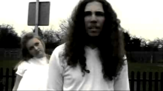
By creating an old time look to our titles sequence it has transformed a normal home video to creepy footage. This sort of footage is common in horror films.
establishes Sub-genre
By using a bleak and desolate looking setting to place the well, it gives the impression that this has been deserted for quite a long period of time. This is common in ghost films as the ghosts generally have died many years ago. By using blue tones this creates a cold and lifeless feel, which mirrors that of what our standard perception of a ghost is.
From this clip from our film you are able to see that it is a ghost horror film due to the boy in the foreground being unaware of the person standing behind him and because of the creepy lifeless way the girl is looking at him.
Establishes character
From this clip from The Grudge you can see that they have used the generic black haired, white clothed deceased girl as the threat. By doing so it creates a mystery as to who she is. Because the deceased girl is behind the victim this instantly makes the victim seem more vulnerable as they cannot see the threat.
From this shot we are able to see that the victim looks like an average teenage boy through the basic clothing he is wearing. We are also able to see that he is very confused about why and where he is due to puzzled facial expressions.
Mise-en-scene
This is a scene from the grudge, they have created an ordinary realistic bedroom which an audience would be able to relate to. The fact that people would be able to relate to it makes it even scarier as it is happening in a normal environment.
The use of a play park in our film gave it a creepy atmosphere as it is supposed to be full of happy children whereas here it is empty and eerie. Using locations that are supposed to be full of people is very common in horror films.
Key Images
The still from The Sixth Sense suggests that the boy in the foreground is the victim as he is lower down in the shot.
We also used high angle shots in order to portray the lead character as the victim, making him appear weak and vulnerable against the girl ghost.
The dim lighting creates a creepy atmosphere, the old books and extra lighting that is needed from the character suggests that this is a fairly old place she is in which is normally the centre of a horror film.
We used fog to create a spooky, eerie atmosphere. This lets the audience know that the threat is about to appear in some way or another. the use of fog is a typical convention on horror films.
The little girl from Silent Hill has been transformed to look as though she has been brought back from the dead. This is done by making her seem very pale and using spats of blood on her face. This is very typical 'dead' make up.
We made the ghost's eyes look slightly darker to give a drained lifeless look to her and dressed her in a dress that looks like a hospital gown to make her seem even more out of place in the park. Giving ghosts costumes like this is very common as they always seemed to be portrayed as slightly insane characters.

By putting the victim in white clothing it makes her seem innocent and vulnerable. The dim lighting is in contrast with the character making her stand out and focus on her stance and facial expressions.


.jpg)


No comments:
Post a Comment